Pearson
Pearson plc is a British multinational publishing and education company headquartered in London, England. They had an iPad App for secondary school students using Common Core Standards for secondary school students initially rolled out in the Los Angeles School District, the largest in the U.S. Challenges included implementing a paperless version of school lessons and assignments that was intuitive for teachers and students that functioned quickly and easily.
Working at Pearson’s New York City office as a User Experience Designer (Freelance), I worked on one of several Agile teams, each made up of one Product Owner, several Developers, a QA person, and Visual Designer. The Product Owner added tasks to our timeline from feedback that Pearson was receiving from the teachers that were using the product.
1 Issue
Feedback from teachers using the app mentioned a need for a more robust navigation system for retrieving workbooks. The Product Owner on my team created users stories that would require additions to the existing app.
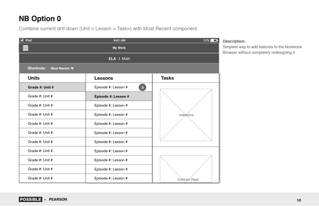
2 Current Drill Down
Because we were working in agile, these additions would come in one at a time over many sprints. The problem with this was that I needed to design something that could adapt to future needs, and not just tack new elements onto the existing app.
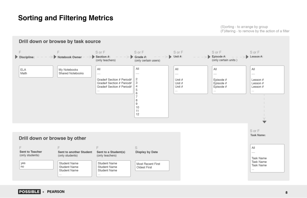
3 Sorting and Filtering
I gathered all of the metrics and created flows describing the different ways that a user could navigate including which items could possibly be sorted or filtered.

4 Concept Sketch 1
Because we were working in agile, these additions would come in one at a time over many sprints. The problem with this was that I needed to design something that could adapt to future needs, and not just tack new elements onto the existing app.
5 Concept Sketch 2
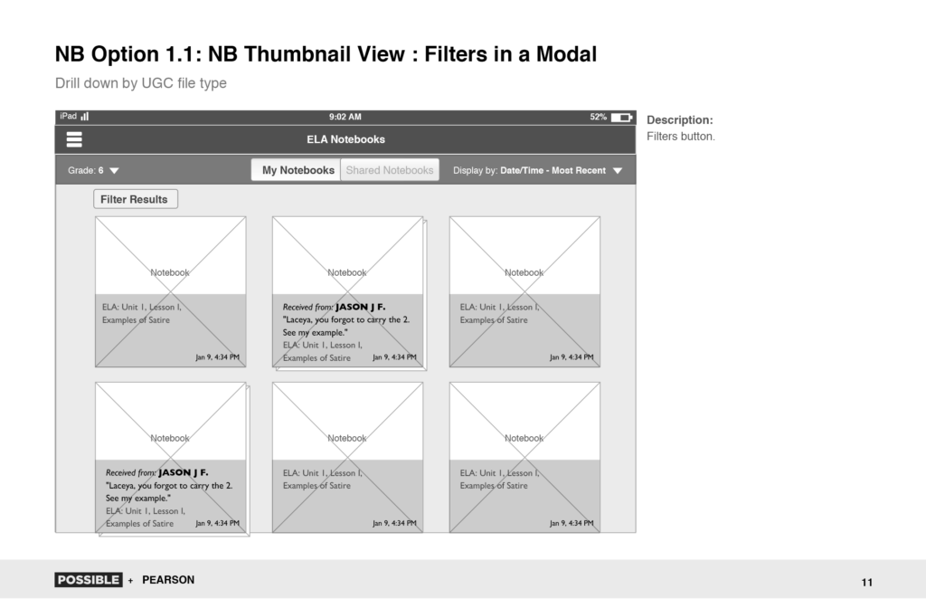
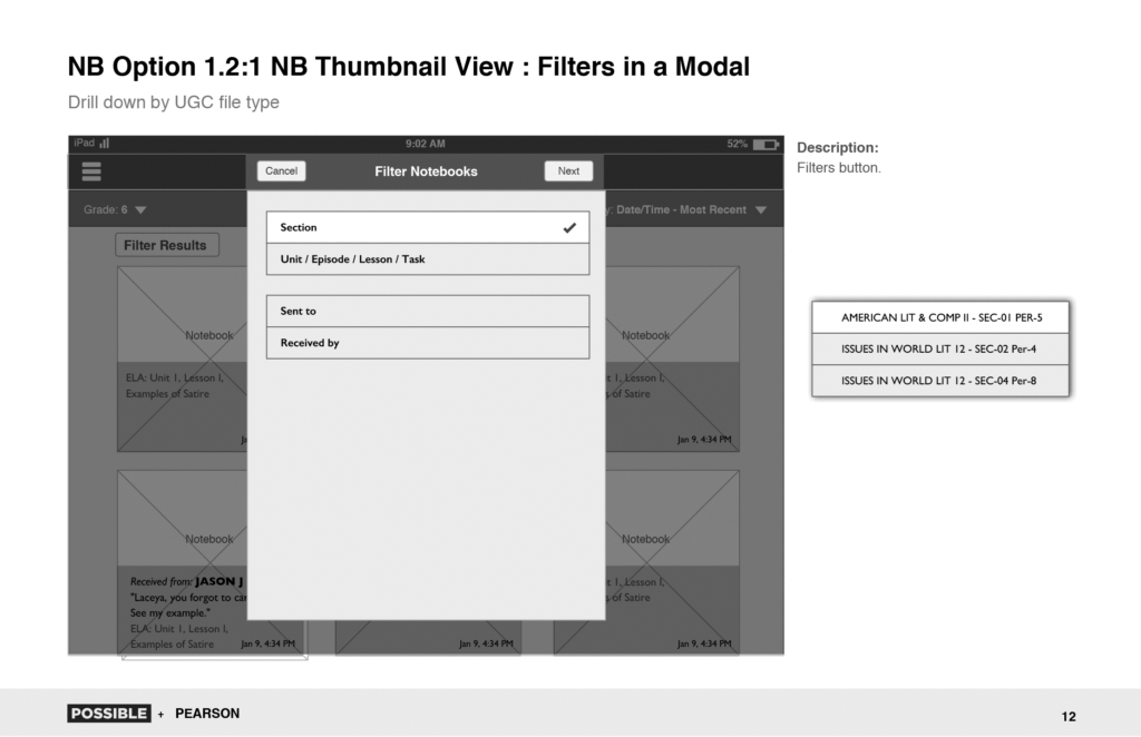
This version shows thumbnails for each workbook within a single grade. I thought this would work better because teachers were more likely to work on a single grade at a time and it allowed them to see a quick overview of the workbooks.
6 Fini
The client chose the second version (here with a filtering modal open).

