

Hum by Verizon
Verizon is an American wireless network operator based in New York City. Rokkan had been selected to work on the website and app for Verizon’s new automobile product, Hum. My involvement included improving the information architecture and navigation for the Hum mobile app.
Working at Rokkan’s New York City office with occasional visits to Verizon Telematic’s Atlanta, GA office as the Senior User Experience Designer (Freelance), I worked with Copyrighters, Content Strategists, and Visual Designers and reported to the VP UX Director, and Associate UX Designers. Rokkan Producers and Account people ran the project and the Verizon team was made up of mostly Product Owners.
1.0 Introduction
Each new project I work on requires an initial immersion period in which I learn as much as I can about the product. The following steps were taken in order to become acquainted with Hum.
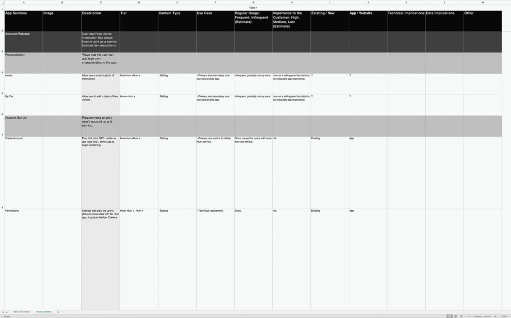
1.1 Features Matrix
Near the beginning of the project members of the Rokkan team including myself, went to Atlanta for an information gathering workshop with Verizon. The end result was a features matrix which was distributed to everyone on the team.
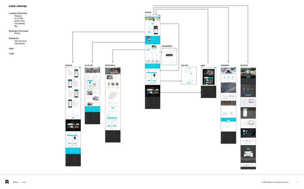
1.2 Competitor Audit
Working from a list of competitors given to us by the client, I created a competitor Website and App evaluation. This screen shows the sitemap of a particular competitor. By studying how their content was structured, I could get a better idea of how they prioritized their features.
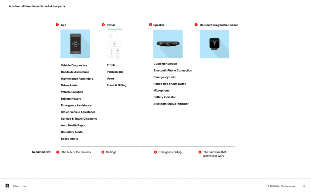
1.3 Product Definition
Unlike a lot of software/website/app projects I’ve worked on, this project had a hardware component. Knowing how each part worked together would affect any design decisions I would make with the app.
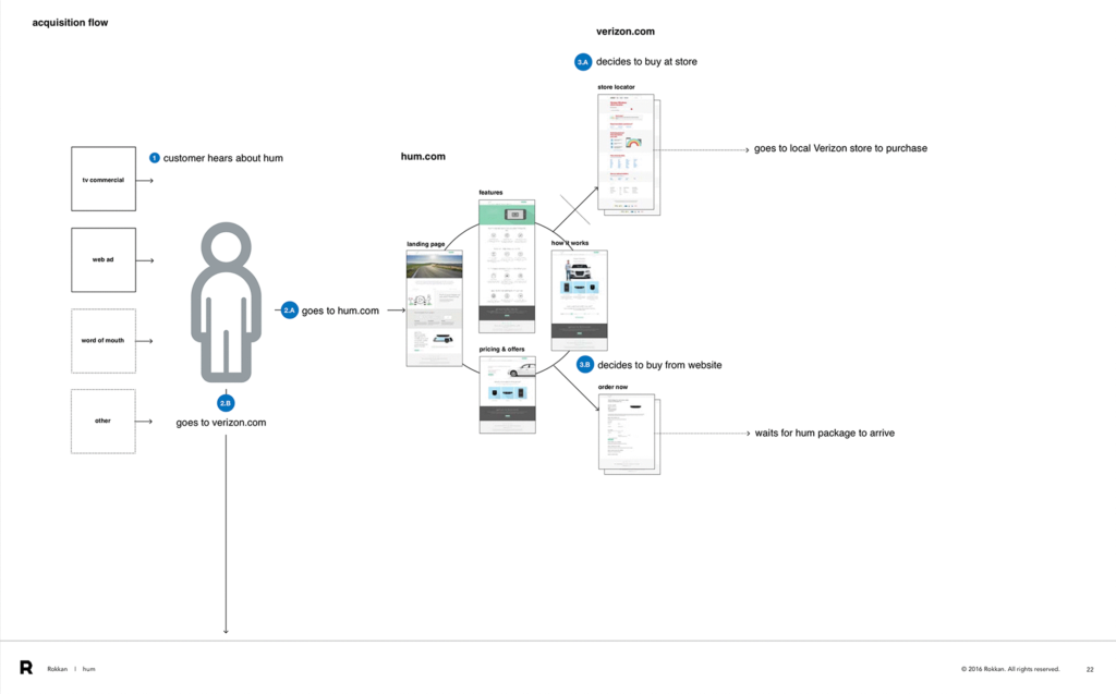
1.4 Acquisition Flow
Since the whole product was more than just an app, I had to understand how users would find out about it and how they would go about purchasing it. Through conversations with the client, I came up with this flow diagram.
1.5 Studying the Website and App
I gathered lots and lots of screenshots and researched Hum’s social network presence. Everything was put into a document that was given to the team as reference. As the project went on, more information was learned and documented.
2.0 Observing User Interactions
The client wanted us to do a small user testing session on the app in order to see how well new users could find and main features and perform basic tasks within them. If they thought the endeavor was productive, they would plan more tests in the future.
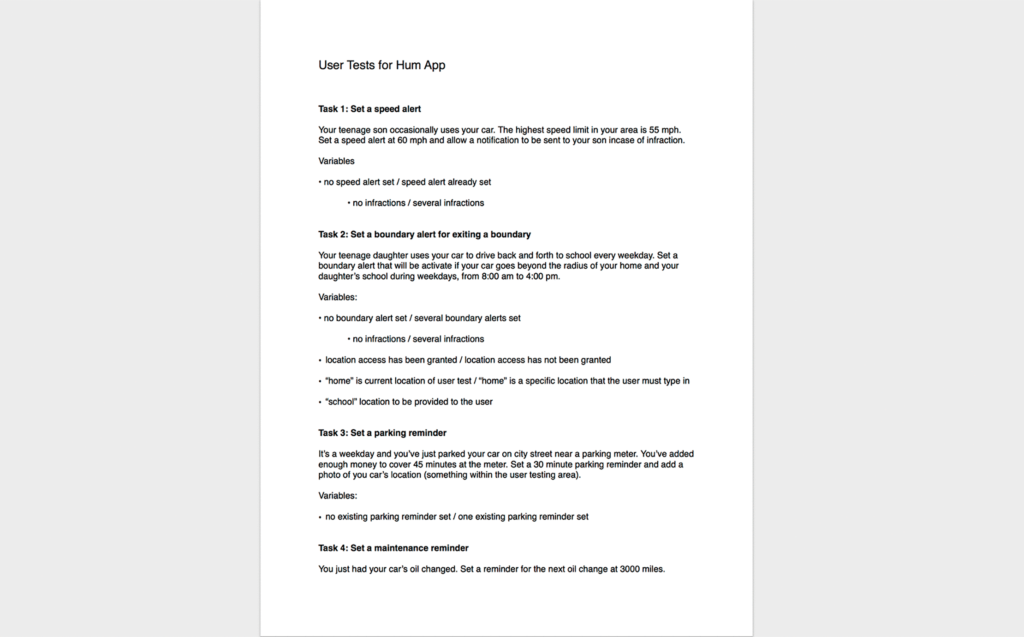
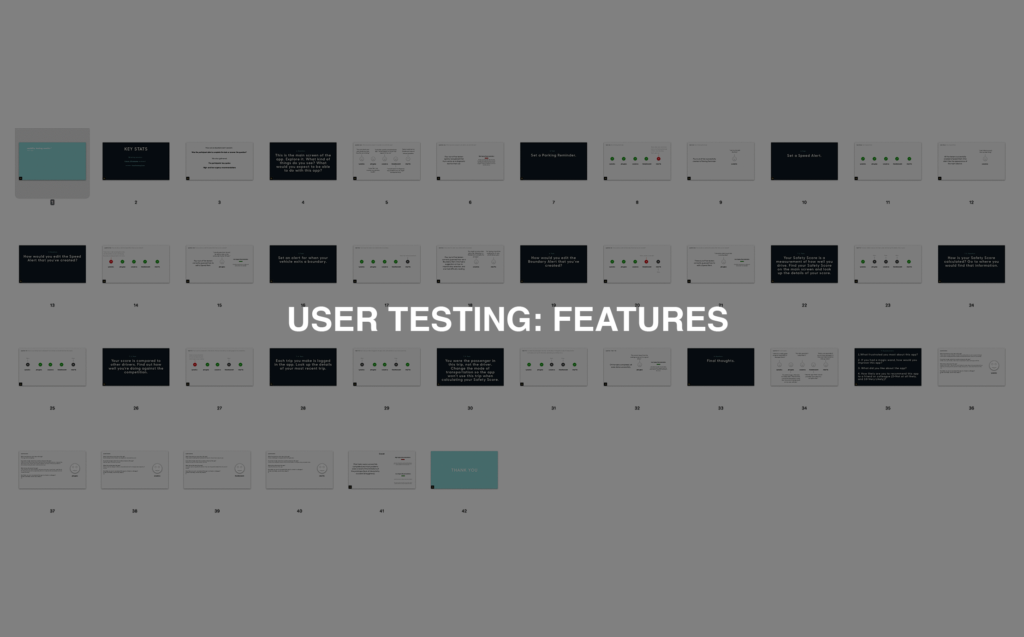
2.1 User Testing Scenarios Script
I wrote a simple script for testing purposes asking users to perform tasks related to the main features within the app. Since none of the users would have seen the app beforehand the concept of it would have to be explained beforehand.
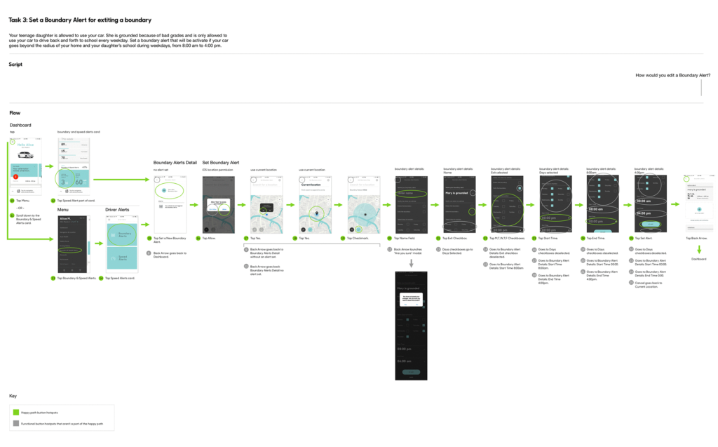
2.2 Scenario Flows
Once the script was approved by the client, I created a flow using screenshots of the app describing the happy path for each scenario, as well as possible detours that could take the users off the path.
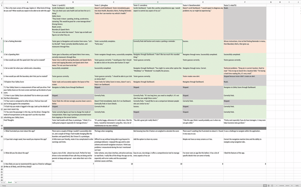
2.3 Testing
On approval of that, I built a prototype in InVision using the screenshots. Using an outside vendor, the tests were recorded and delivered to us. I watched the recordings and wrote down how each user performed and any important quotes in a spreadsheet.
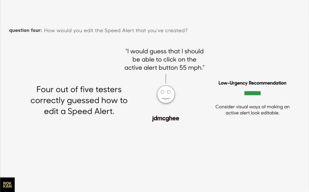
2.4 Results
The results were good, the majority tasks were successfully completed. The users’ quotes were very helpful in showing areas that could use improvement. I put the results into a Keynote deck along with UX recommendations to present to the client.
3.0 Information Architecture
Analytic reports were showing that a lot of users simply weren’t using many big features within the app. The supposition from the Verizon team was that users didn’t know about the features or had difficulty finding them.
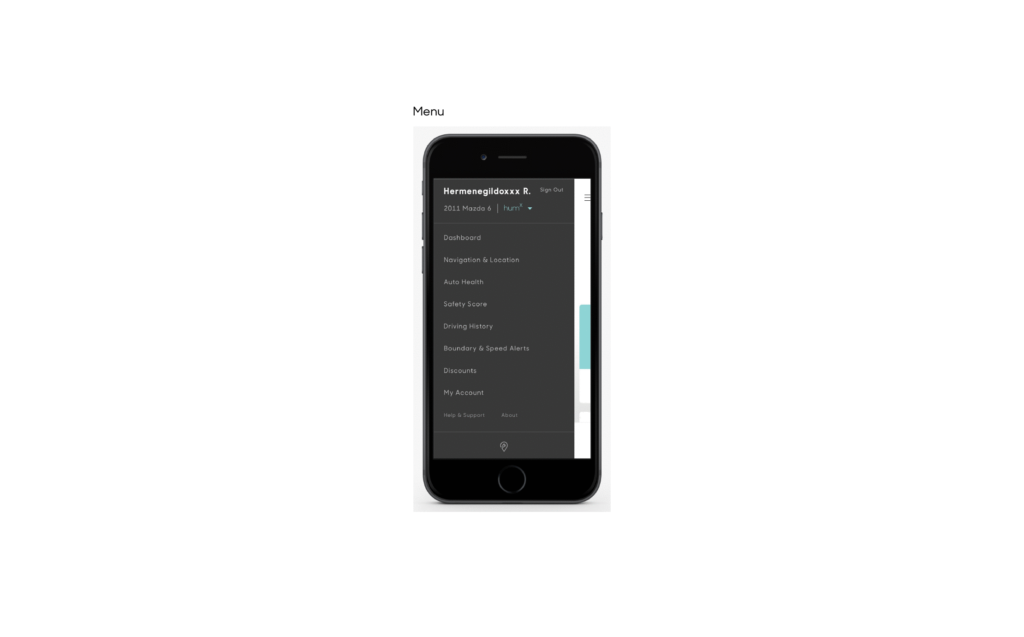
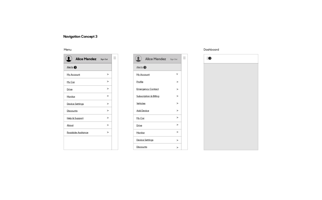
3.1 Menu
One of the main problem’s was that every section within the app had its own link the app’s menu drawer. Most had the same type color and size which reduced scanability. The current design filled up most of the screen which would be a problem for future additions to the app.
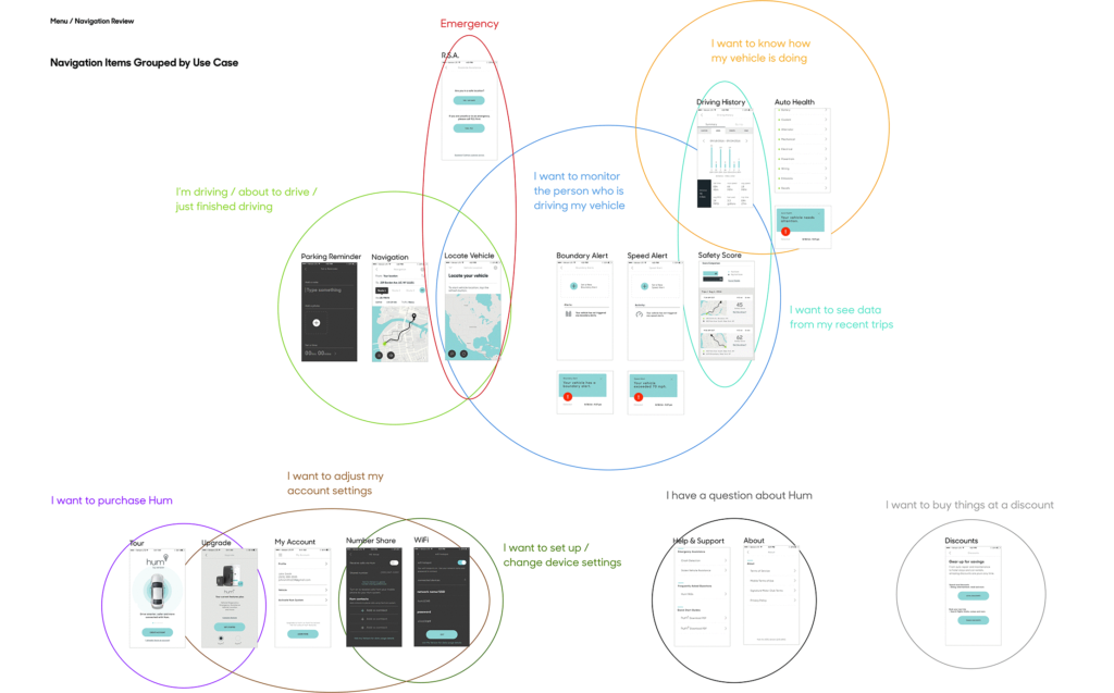
3.2 Grouping Similar Items
I proposed grouping items by use case which would give the navigation a clear hierarchy and a simple mental model. The thing that the user was trying to accomplish would be named and grouped by what the that activity.
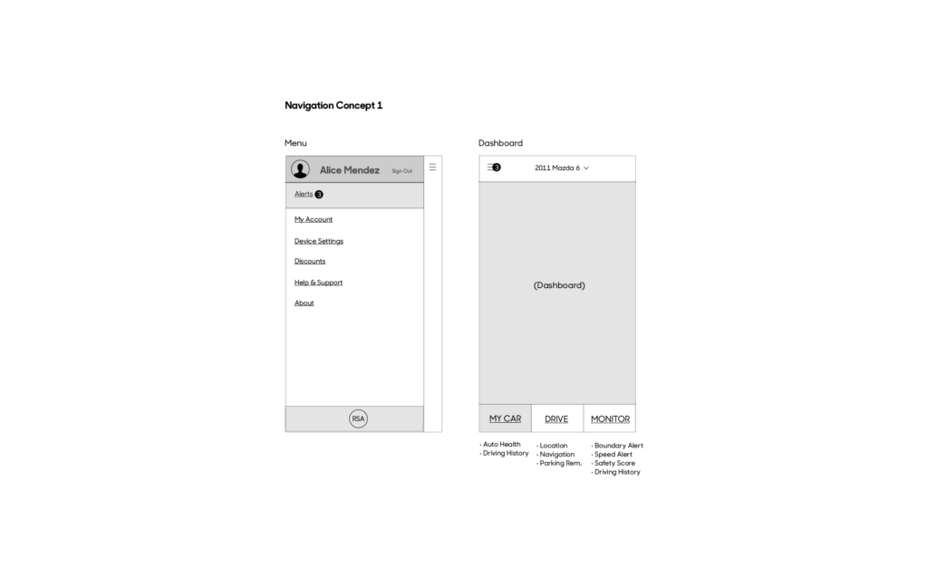
3.3 Concept Sketches 1/3
Since this would be a major change to the app, I drew up three concepts to show how a navigation redesign could possibly work. This screen showing a version of the menu drawer only containing items that weren’t on the main app screen.
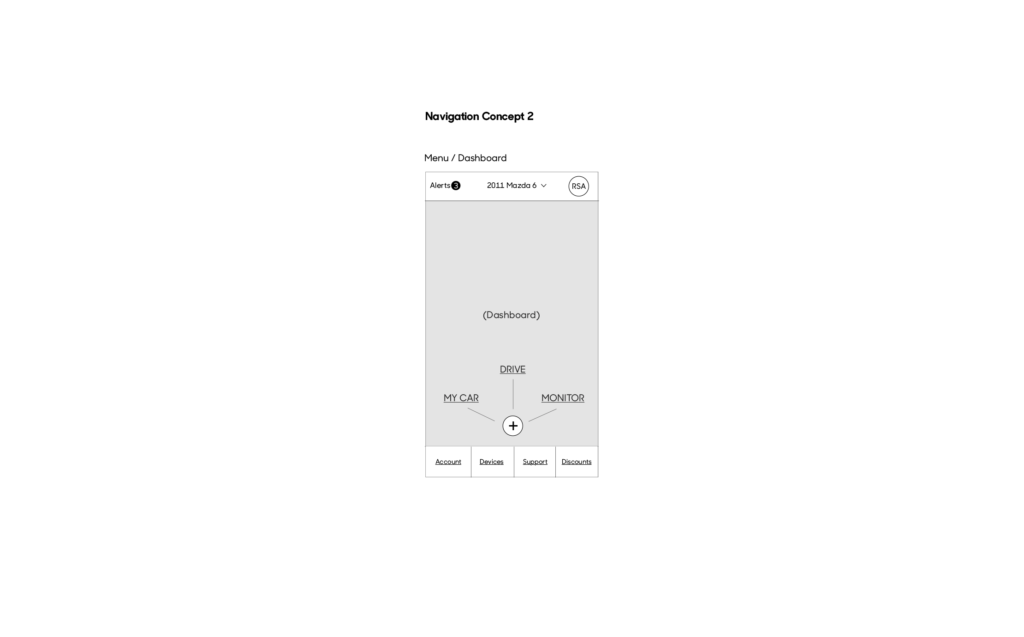
3.4 Concept Sketches 2/3
A second version without a menu drawer but with menu items in the footer of the main screen along with a floating point menu to navigate the biggest features.
3.5 Concept Sketches 3/3
And a third version with a simple expand collapse menu. This version is simply to show how the navigation could be updated with the least amount of change to the app.
3.6 Presentation
These were put into a presentation to the client along with pros and cons of each concept. The result of which led us to initiate a larger round user testing with card sorting exercises in order to find out which navigation groupings made sense to users.