

Henry Schein
Henry Schein, Inc. is an American distributor of health care products and services with a presence in 32 countries, headquartered in Melville, NY. They were working with Code and Theory to redesign their public facing e-commerce website as well as their field sales consultant web application. I was tasked with working on the latter with the goal of creating an intuitive app that would allow sales reps to sell more efficiently.
Working from home as the Associate Director, Interaction Design (Freelance), I worked with Experience Strategists, Interaction Designers and Visual Designers. The project was run by a Producer and Account person.
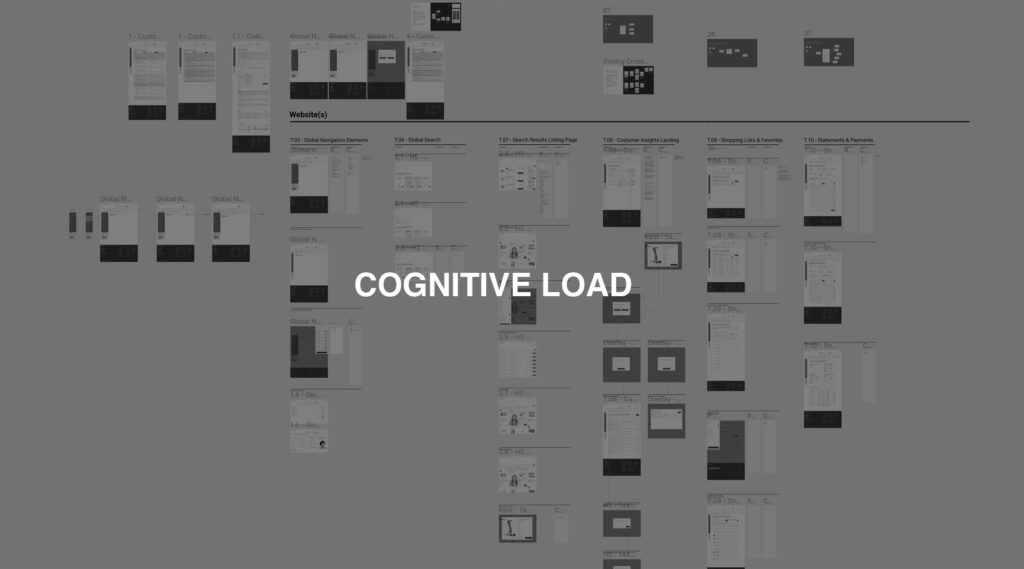
The company had been using an outdated proprietary application that ran on Windows NT. It was reliant on the sales reps to memorize an inordinate amount of tabs and small windows to quickly find the customer and product information necessary for their sales appointments. The new design direction was to be more dashboard-like, similar to what you see in many health apps.
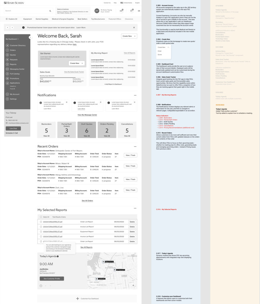
The landing page dashboard was pieced together from various design elements that had been created for Henry Schein’s customer website which had been designed by Code and Theory six months earlier. This was done in order to save time as well as build out a cohesive design system for both customer and sales rep and to reduce cognitive load. The challenge was gaining an understanding of the business requirements by continually meeting with the stakeholders, and then altering the page components so that they would serve up the most pertinent, personalized information to the sales reps to reduce the burden of navigating through their current complex and fragmented application. Through user testing we discovered that the sales reps had an overall positive reaction to this design, citing it as “user friendly”.
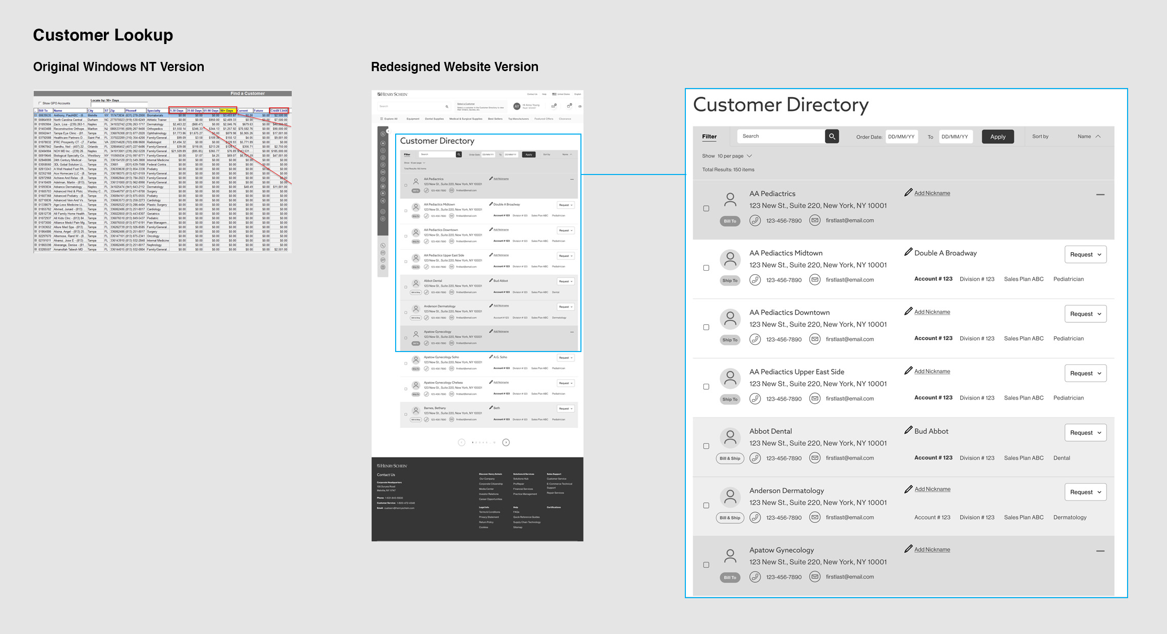
Once the landing page dashboard was signed off on, I began work on the Customer Management wireframes where sales reps accessed the information about their clients. This involved taking line item information and creating cards for each individual customer, in keeping with the more modern dashboard-like design direction. The original system was built without user feedback so now I had the chance to improve upon it by asking the stakeholders their specific wants and needs. This allowed me to come up with a visual hierarchy of importance which affected where information was located with the most pertinent items more pronounced than those that were needed less often.