

Morgan Stanley
Morgan Stanley is an American multinational investment bank and financial services company headquartered in New York City. Code and Theory was asked to make updates to some of their previous work with Morgan Stanley with the goal of improving content discoverability and engagement in order to build brand trust. I was tasked with improving the ways users found content, specifically in the “Insights” section of the website.
Working from home as the Associate Director, Interaction Design (Freelance), my team was made up of Experience Strategists, Interaction Designers and Visual Designers. The project was run by a Producer and Account person. Morgan Stanley provided the Development team.
Morgan Stanley had a broad taxonomy for categorizing their content which was how they were structuring their navigation. Although very thorough, it wasn’t particularly user-centric. Users had to work to find the content they were looking for. The Experience Strategists I worked with at Code and Theory worked on possible themes that would work well with the existing taxonomy, surfacing relevant content to the user. I worked on the specific user interface that the content would appear through.
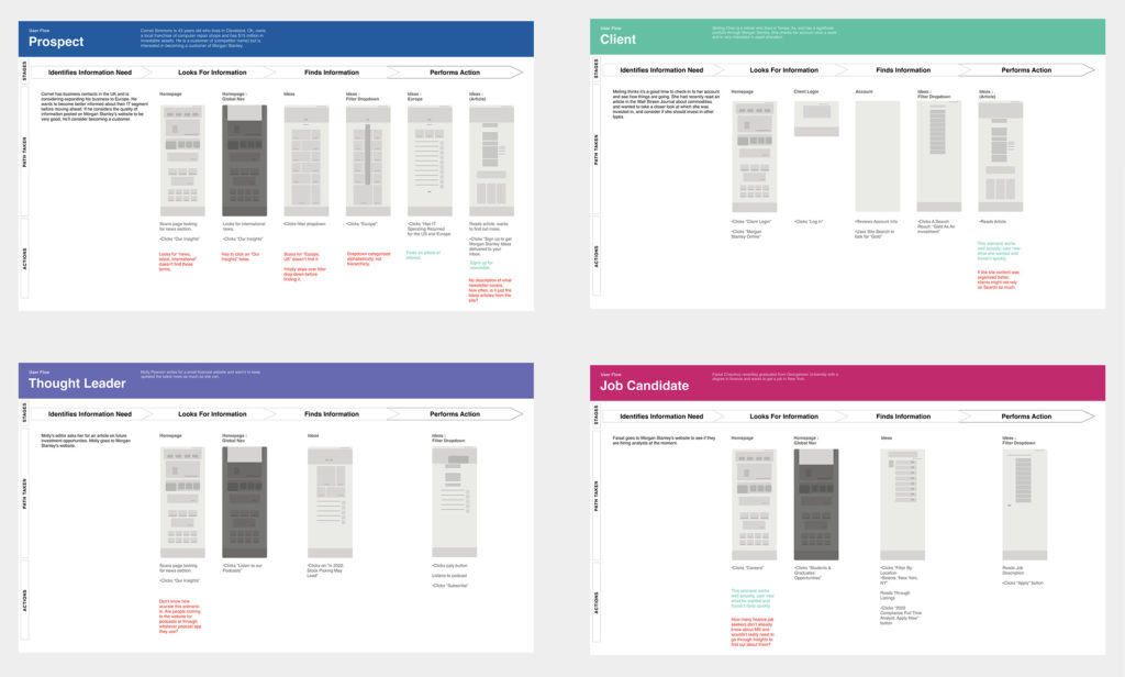
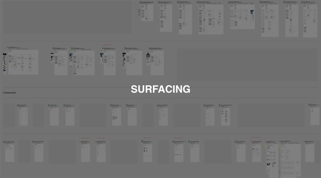
One of the first things I did was to make an audit of the Insights section with the goal of gaining an understanding of it’s current navigational structure and to see if there were pain points. Then created four user journey maps based on demographic information gained from the experience strategy team. I created four fictional personas from the top four Morgan Stanley audience types and wrote some simple scenarios based on their needs.
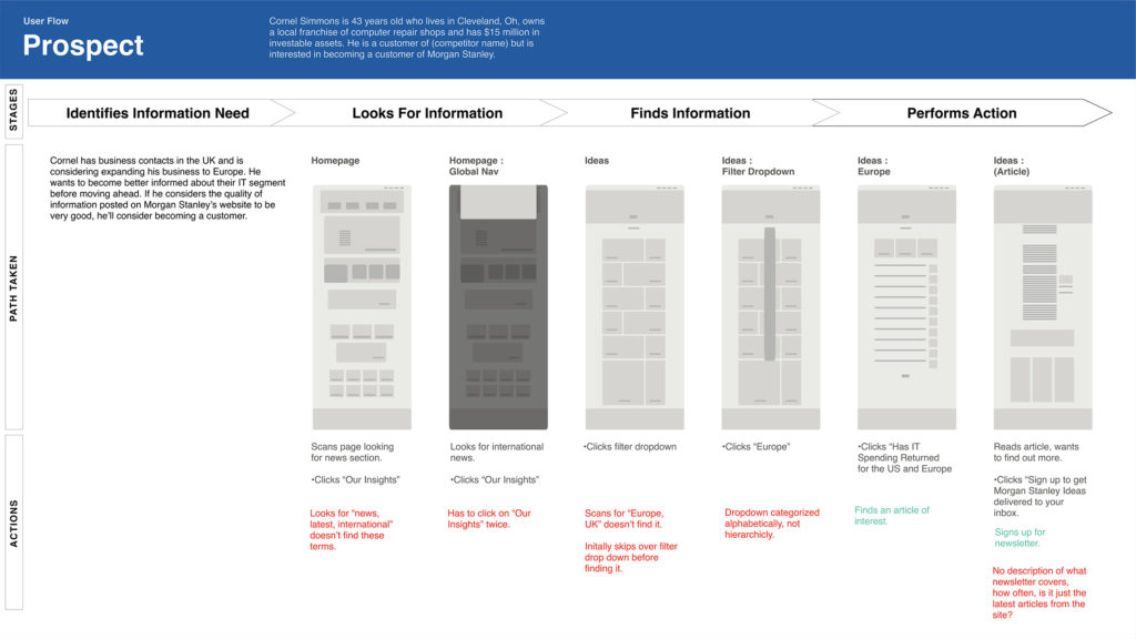
This flow describes how a prospective customer with a specific goal might go about finding desirable content through Morgan Stanley’s existing website. It describes the interactions that the user must go through and critiques them. From there the next task was to design navigational interfaces.
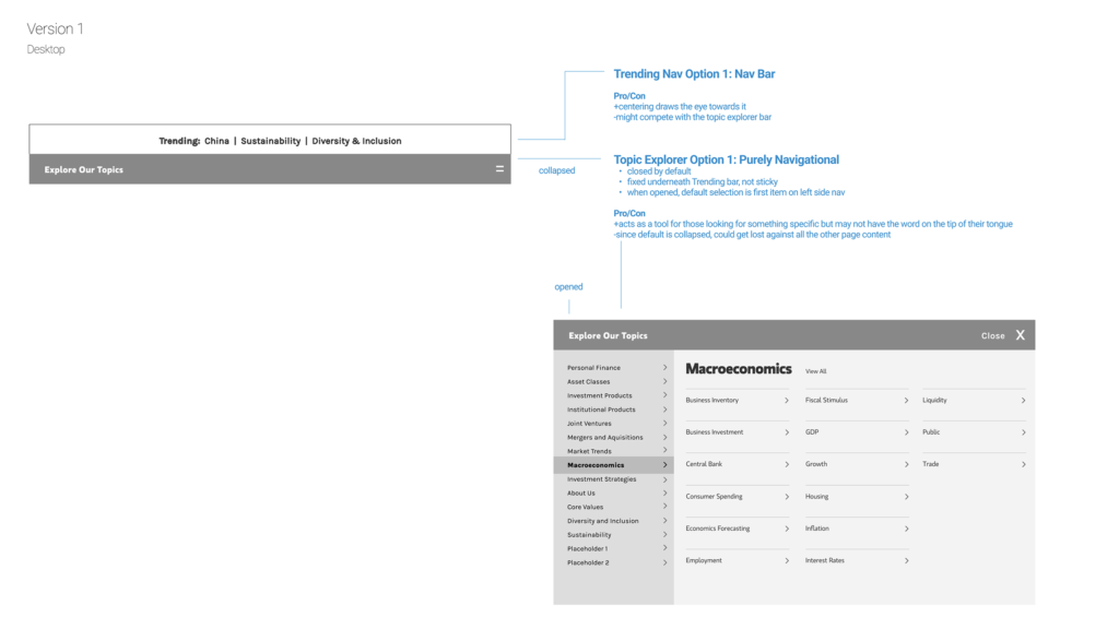
The first option was a collapsible mega nav menu which worked with Morgan Stanley’s existing taxonomy. The Experience Strategists suggested a “Trending” part of the navigation for those looking for what was timely and popular. I pointed out the potential issue of it being collapsed on page load which might make it a little lost on a landing page loaded with content.
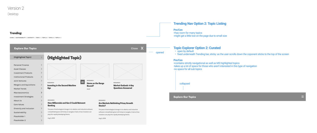
The second version was based on the first, but this time it would be open by default and I replaced the subcategory area with curated content. This would meet the content strategy goal of showing Morgan Stanley as a thought leader as well as making the website timely (the curated content would be rotated regularly), but would take a lot of space on the page as well as insure that there would have to be a second navigation area on sub level pages.
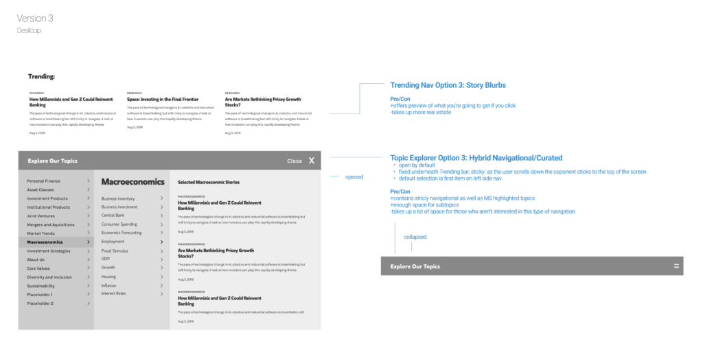
The third version combined parts of the first two, to meet the demands of content strategy and Morgan Stanley’s existing taxonomy. While this version was the preferred one, the whole exercise of creating these navigational options led the client to decide to simplify their taxonomy for the sake of ease of use for their audience.