

Verizon Cloud
Verizon is an American wireless network operator based in New York City. Publicis Sapient had contracted to work with Verizon on many projects, including their Cloud service which was my focus. My main tasks were improving the onboarding process, adding tag functionality, and improving the search process.
Working from home as the Senior User Experience Designer (Freelance), I worked with a Creative Director, Visual Designers, and a Junior UX Designer. A Publicis Sapient Producer ran the project and the Product Owners, Tech and Development teams worked for Verizon.
As a User Experience professional I’m often brought into projects that have already been built but aren’t quite living up to the expectations of the business owners. The sign up and onboarding processes for online services have to work as seamlessly as possible while including the required legal checkboxes and any other parts of the app that need to be set up in order for the product to function once the user has gone through the sign up and installation procedure. Verizon was having an issue with many users quitting before completing the sign up and boarding flow for their Cloud service.
A large part of the problem was that some of their customers received access to Verizon Cloud as part of a package deal when they purchased a Verizon phone. These customers would tap on the Verizon Cloud icon on their new phones and be sent down the sign up and onboarding flow, which had more steps than they had anticipated and more than likely why the drop-off was happening.
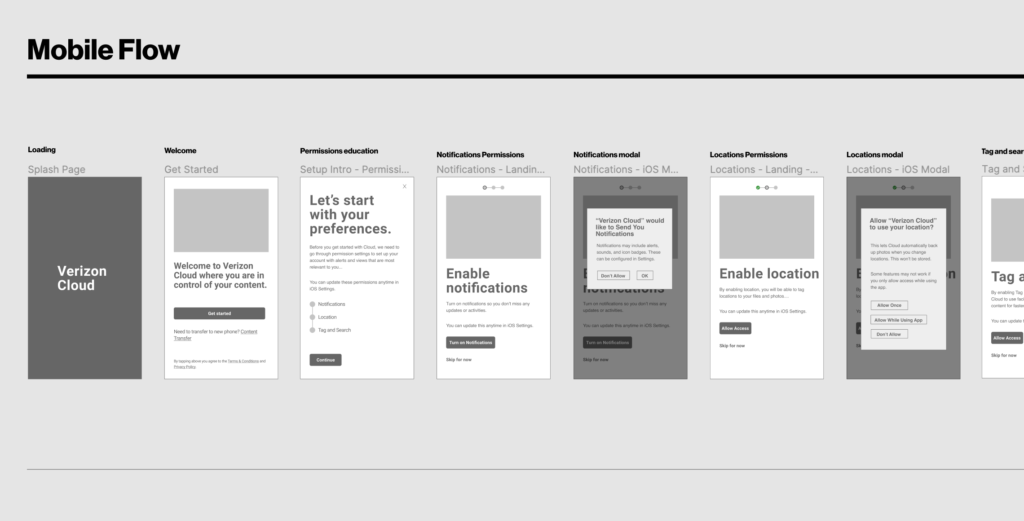
The solution was to figure out each possible scenario by plan type and operating system to first identify which steps were required and which could be either removed or moved to after the sign up flow. After clarifying these requirements with the Verizon dev team, I created a flow diagram that illustrated the screens that would be required up front and those that could be delayed until after the app had been installed.
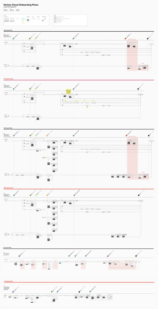
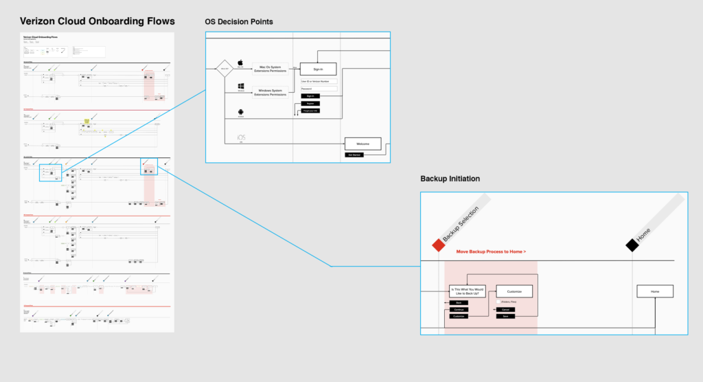
The color pink is used in the diagram to highlight parts of the flow that could easily be moved, in this example, the backing up of files into the Verizon cloud. This process could take hours and leave the app unusable until complete. By moving this part of the flow until after installation, Verizon could get the app up and running on the users’ device and more clearly inform the user that backing up would be something the user could start when they wished with the understanding that they would come back to the app later upon completion.
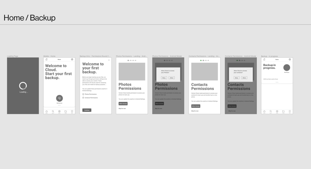
Along with backing up, any permission screens were moved so that they wouldn’t appear until needed. For instance, initially the iOS permission to access photos screen appeared when the user was first installing the app. Now it would only appear when the user actually took the action to back up their photos into the Verizon cloud. The product owners enthusiastically agreed on moving forward with this plan of action and it was moved into development.