

Wyndham
Wyndham Vacation Ownership is a Time Share company based in Orlando, FL. The client had been using an outdated MS-DOS command-line booking application for customer reps. They asked Rokkan to design a new modern GUI that followed the same branding standards they were creating for Wyndham’s customer website. The goal was to improve the speed and efficiency of customer calls to the reps as well as create a more modern system that new reps could learn more quickly and easily.
Working at Rokkan’s New York City office as the Senior User Experience Designer (Freelance), I worked with a Director of UX, a Junior UX Designer, anAccount Supervisor, Producer, Business Analyst, and several Visual Designers.
One thing that UX Designers need to ask when taking a clients business requirements and translating them into user interfaces is: “What is the context in which this will be used?”. You need to give the user the correct information and controls at the moment that they need it, and not bog them down with what they do not need. This can often be seen best when you compare a website on your desktop computer vs. the same website on your smart phone. Although this project was desktop only, the client wanted the product to work on their existing monitors, so there was a certain size limitation. The customer reps needed to be able to use the application as quickly as possible in order to maintain positive customer relations, so there was constant back and forth discussion on what needed to be seen at all times vs. what could be hidden based on the customer rep’s actions.
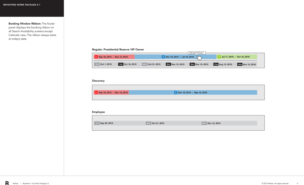
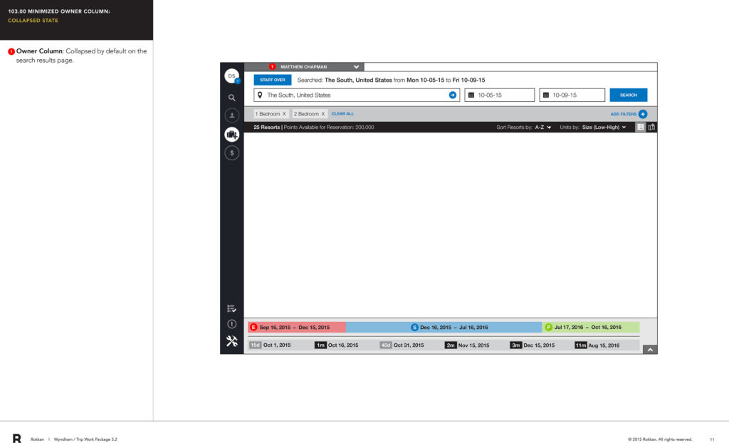
I worked on what we called a Booking Window Ribbon. This dynamic component always started at today’s date and described the various “booking windows” that a Wyndham customer could reserve vacation properties. Wyndham has certain business rules around when customers could make reservations that affected the pool of available rentals that could be chosen as well as the cost of the rentals. Because of the complexity of the rules, one the most often types of customer calls related to gaining an understanding of what the customer could reserve, when, and for how much. Adding to the complexity, the cost was expressed as “points” not currency. The reps were adamant that this information could be seen at all times.
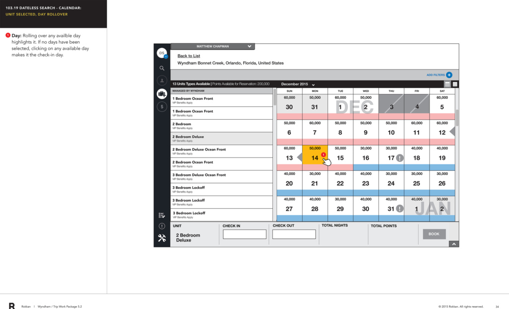
When the task became more specific to actually booking a reservation, the rules around the booking ribbon’s rules could change with it. Instead of being a quick reference for customer reps to convey booking windows to the customer, it now need to interact with the particular selections (rental properties) that were being made. This calendar I worked on view replaced the ribbon with a reservation summary module and the booking window information (start and end dates) was transferred to the calendar grid. The “points” costs would display dynamically depending on the rental unit selection and the booking window.
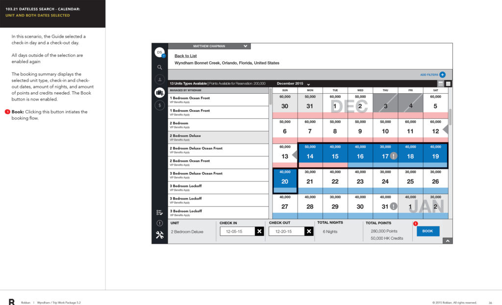
In this screen the rental property and unit have been selected along with the length of stay and the specifics of the reservation including points costs are shown in the summary module at the bottom. The client was pleased with this solution.